On a mission to design
someone's future favorite book...

BOOK COVERS and INTERIOR ART
my portfolio


An imaginary sapphic/southern gothic horror novel cover that I created one night at the end of the summer.
I got the idea to draw an eldritch cryptid spirit in the entryway of an old farmhouse. If this was the cover
of a real story, what do you think it would be about?

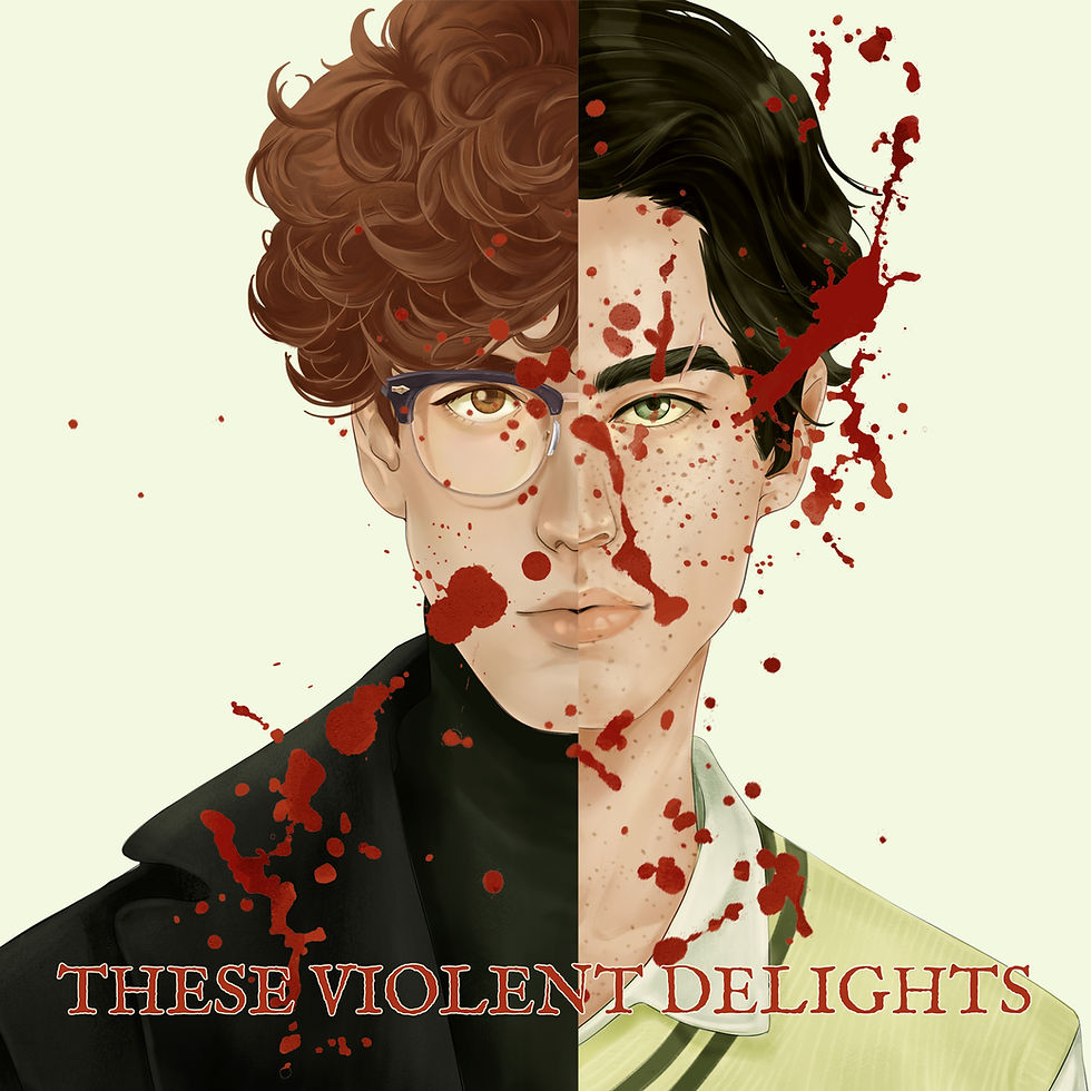
A complete illustrated re-design collection I made of Micah Nemerever's queer dark academia thriller, "These Violent Delights" Includes: Full Paperback Cover Design, Audiobook Cover, Tropes Map, Hardcover Mockup,
Paperback Mockup, and Quotes for social media.

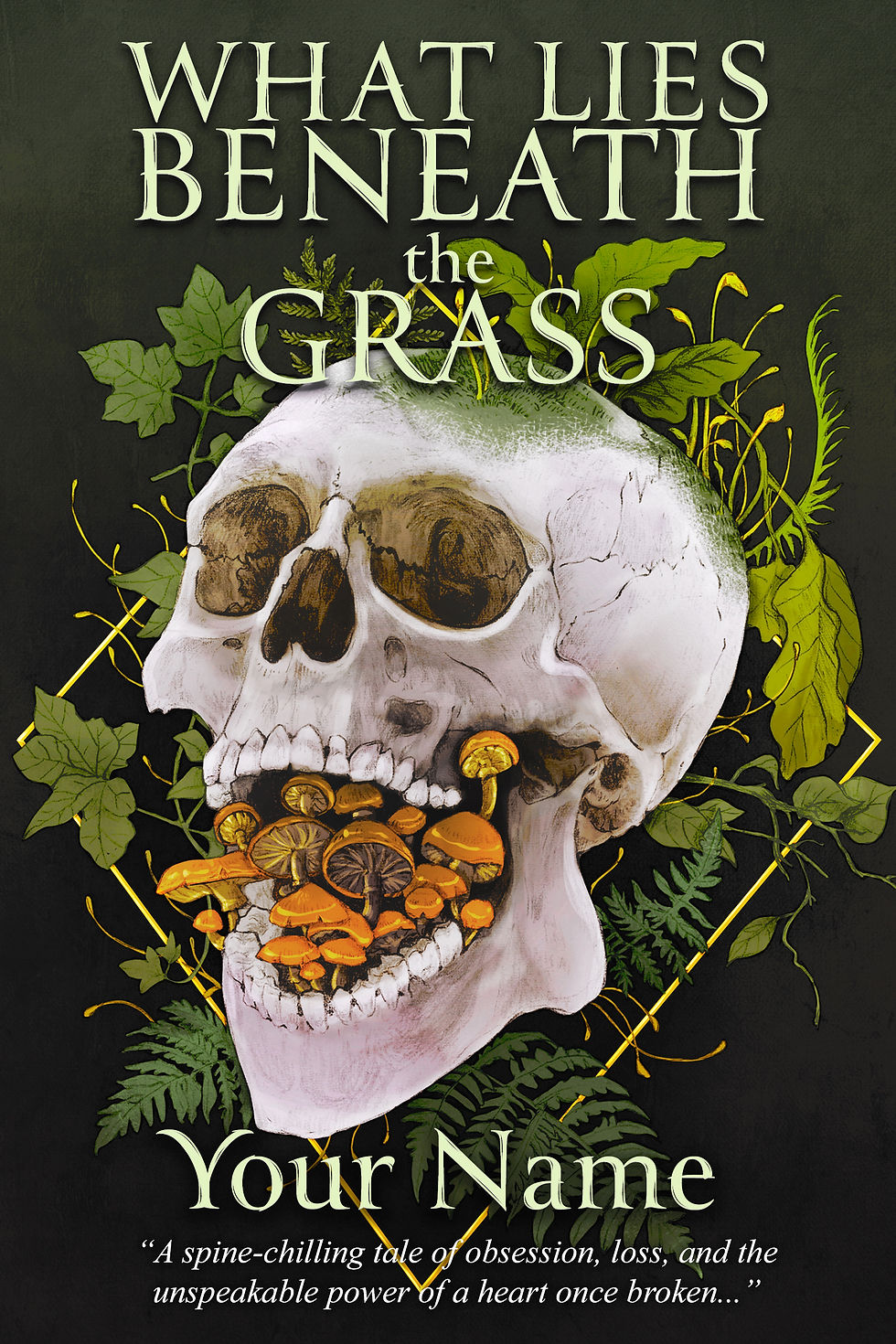
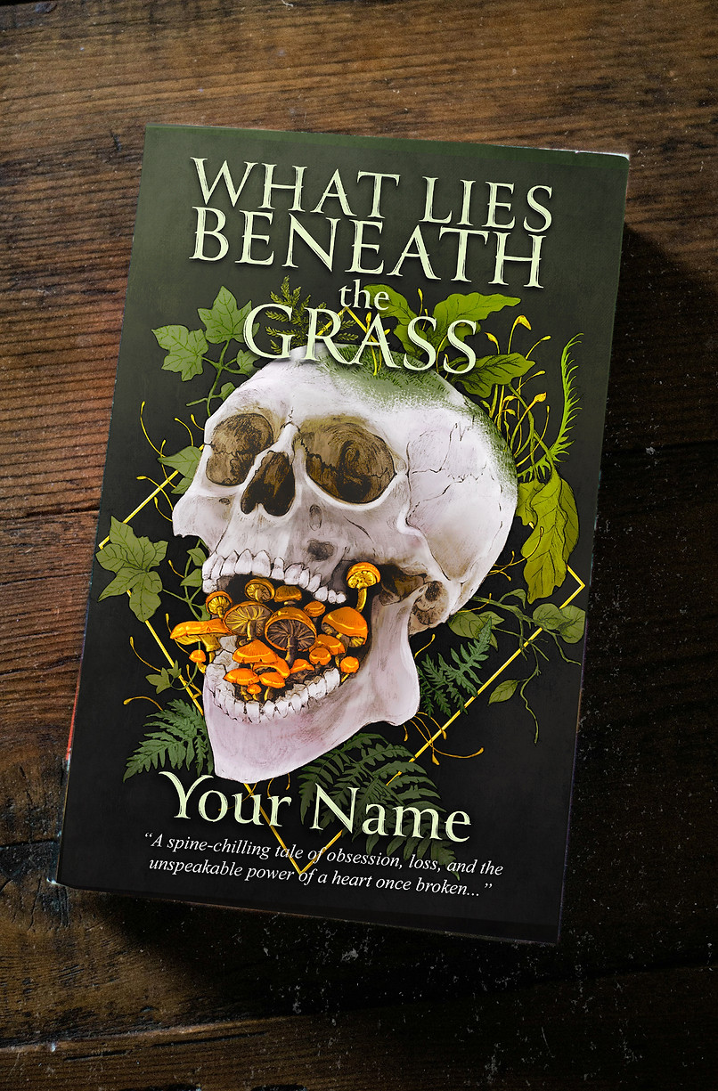
Using an illustration I made with the dark naturalism elements I'm so fond of within the dark academia/gothic horror genres in mind, take a look at what's possible to showcase your novel with a front cover mockup, the clean (no text) artwork, social media promo quote slide, and promo art featuring one of your impactful quotes!
interior art
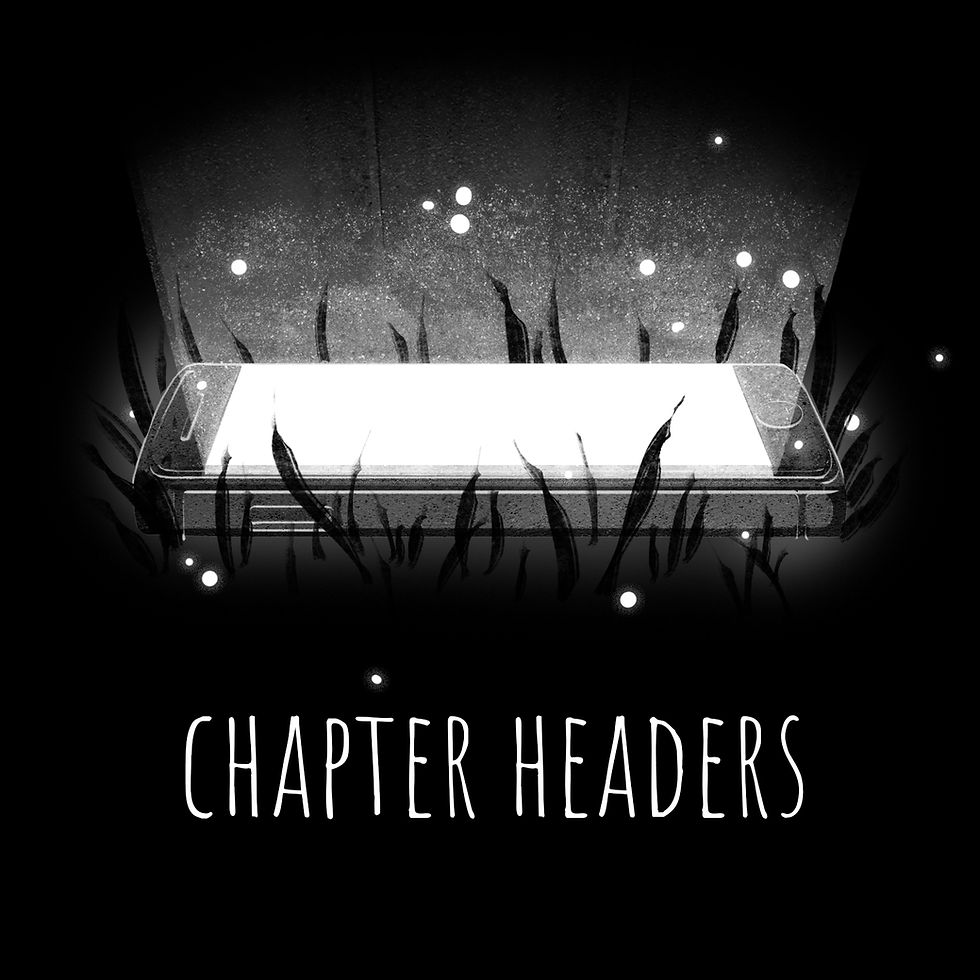
A collection of chapter headers for the contemporary sci-fi novel "Because You'll Never Meet Me"
(2017) by Leah Thomas.
Each one is based on a significant moment or objectthat highlights the chapter's main theme.
typography


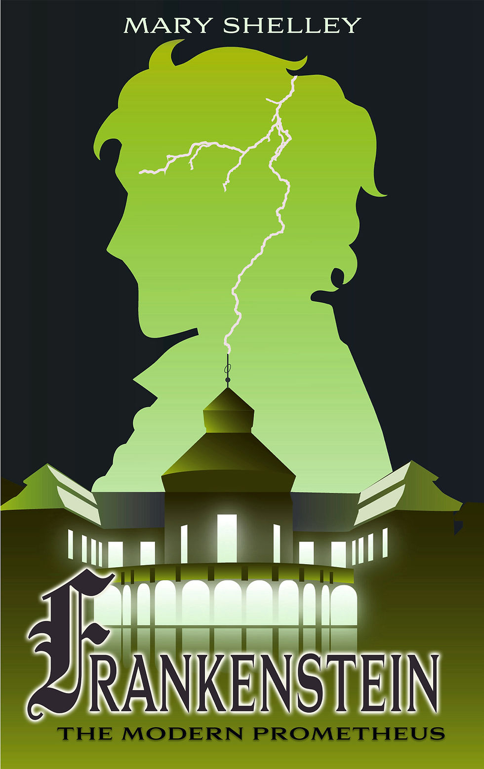
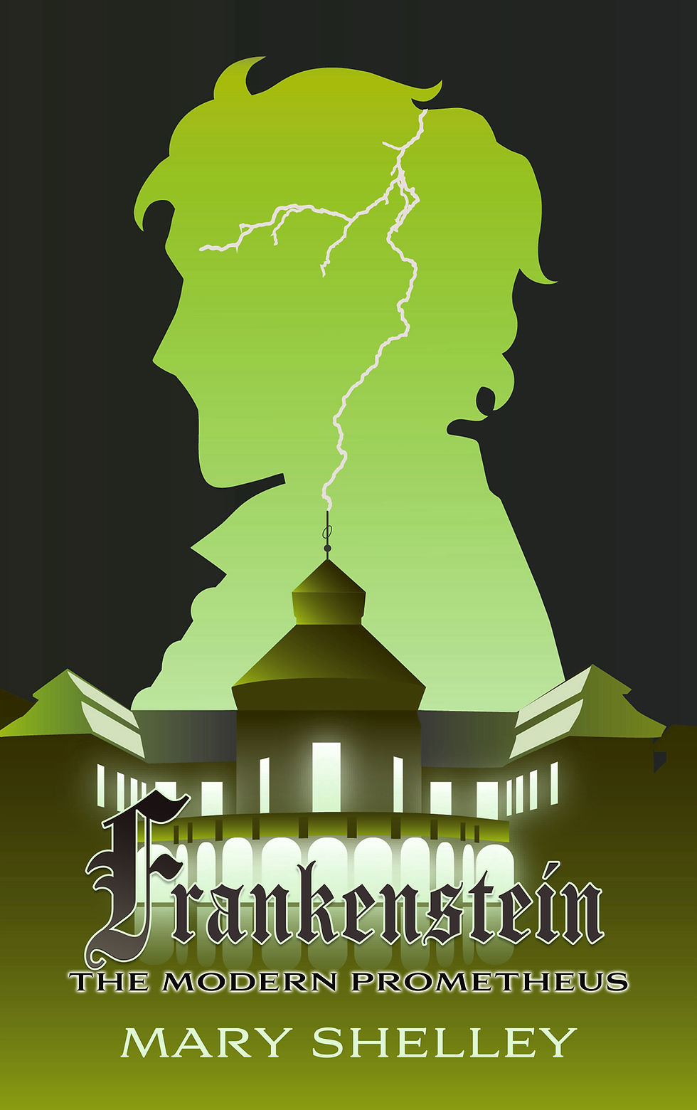
FRANKENSTEIN (1818)

The evolution of a clean vector art design for the original 1818 Frankenstein novel with a focus on typography
FEBRUARY
DEC (version 1)
DEC (version 2)
WE CONTAIN MULTITUDES (2017)

ORIGINAL VERSION

MY VERSION
We Contain Multitudes is a heartfelt YA contemporary queer romance about two boys assigned to each other
as project partners in their English class.
The assignment? Write each other one letter per week.
Jo's love of Walt Whitman soon rubs off on his partner Kurl, and they discover there's much more to each other (and themselves) that meets the eye.
For two Walt Whitman fans who become addicted to
the art of pen-pals, I personally thought a much more decorative font with plenty of personality and flourish, Amoretta, was more appropriate for a YA romance!
A STIR OF BONES (2003)

ORIGINAL VERSION
A Stir of Bones is the stand-alone prequel to acclaimed fantasist Nina Hoffman's award-winning adult novels A Red Heart of Memories and Past the Size of Dreaming.
It's what I now consider a mix of historical and contemporary since the story itself was written in the early 2000s, takes place in the 80s, and revolves around a haunting from almost a century ago.
The typography was minimalist and simple serif font in all lower-case letters.

MY VERSION


Here are some different variations I created combining the fonts: IM FELL English an Antiquarian Scribe. Doesn't it add a little visual interest to change the size and spacing?